Saturday, 25 January 2014
Question 4: Plan
What have I learnt from audience feedback?
I will add videos of audience feedback for the music and make a video of myself of me reflecting from it and also I will talk about what I have learnt from all of this. I will also talk about the feedback that I got from my group and Mary about my digipak and advert and I will talk about this a lot because I don't have any videos for that feedback.
Friday, 24 January 2014
Question 3: Plan
How did I use media technologies in the construction and research, planning and evaluation stages?
I will talk about all the technology I used to present my work (Blogger, Prezi, Gif Maker etc.) and also list all the equipment we used to make the music video and talk about how we used them. I will also need to talk about all the software I used to make both the digipak and advert. Another thing that I will talk about is the social sites we used to show some of our progress which were Twitter and Instagram.
Question 2: How effective is the combination of your main product (video) and ancillary text (digipak and advertisement)?
Synergy In Music Video
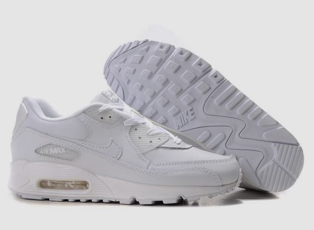
When we discussed as a group for what should be Jaleesa's synergy, our first initial idea was to use her white Nike trainers that she always wore. That was the synergy till the point where we found out that we had to redo many shots again but we would have to start all over again because our artist Jaleesa had changed her hairstyle. When we started to re-record our scenes again, we all decided to change the synergy to Jaleesa's new hairstyle which were braids. We really liked this idea as it is an unusual synergy to have.
When we discussed as a group for what should be Jaleesa's synergy, our first initial idea was to use her white Nike trainers that she always wore. That was the synergy till the point where we found out that we had to redo many shots again but we would have to start all over again because our artist Jaleesa had changed her hairstyle. When we started to re-record our scenes again, we all decided to change the synergy to Jaleesa's new hairstyle which were braids. We really liked this idea as it is an unusual synergy to have.
This was the original synergy we wanted to use.
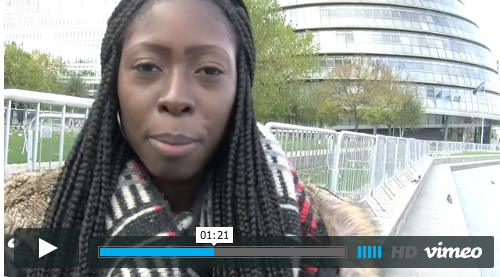
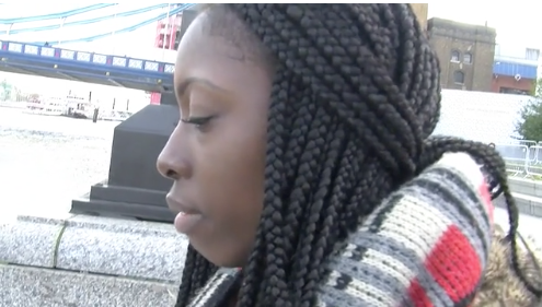
This is Jaleesa's braids which became the new synergy.
When we researched who else in the music industry who had braids in some parts of their music video, we found that two other people had done this. They are Beyonce and Brandy.
Here is an example of Beyonce's braids in her music video called "Grown Woman".
Here is Jaleesa in the music video that we made with her braids.
Synergy In Digipak and Advert
When we was preparing to take the pictures for the digipaks, we stuck with the braids to make it the synergy throughout so it would be linked to the music video and also this is so that when the audience see the music video and then they are to see the advert and the digipak, they would know straight away that this is the same girl from the music video that they had watched and they would know this from the braids.
This is the front cover of the digipak and as you can see, this image that has been used has the braids that you see in the music video. When I was making the digipak, I also wanted to create a synergy for both the digipak and the advert and what I made the synergy here is the black background, the two types of text and the colours of the text. The colour of the word "Jaleesa" is the same colour as the top that she is wearing in the picture that is used on the front cover and I used white because white looks good on a black background and also I used this colour because I tried to use the orange from the skirt that she is wearing and it didn't look good so that's why I chose white.
On the advert, you can see that I carried on the synergy by using the same text that is on the front cover of the digipak and by also using the same colour that is on the front cover. I also included the front cover of the digipak on the advert so it would include the use of the synergy of the braids and also for the audience to know what album I am advertising of the artist Jaleesa.
Evaluation question 4: What have you learnt from your audiencefeedback? FINAL
The feedback given to me by the target audience and how they felt the whole video looked.
After showing my digipak and advertisement to my target audience, i recorded some feedback and got what they thought of my ancillary work and how i could improve it.
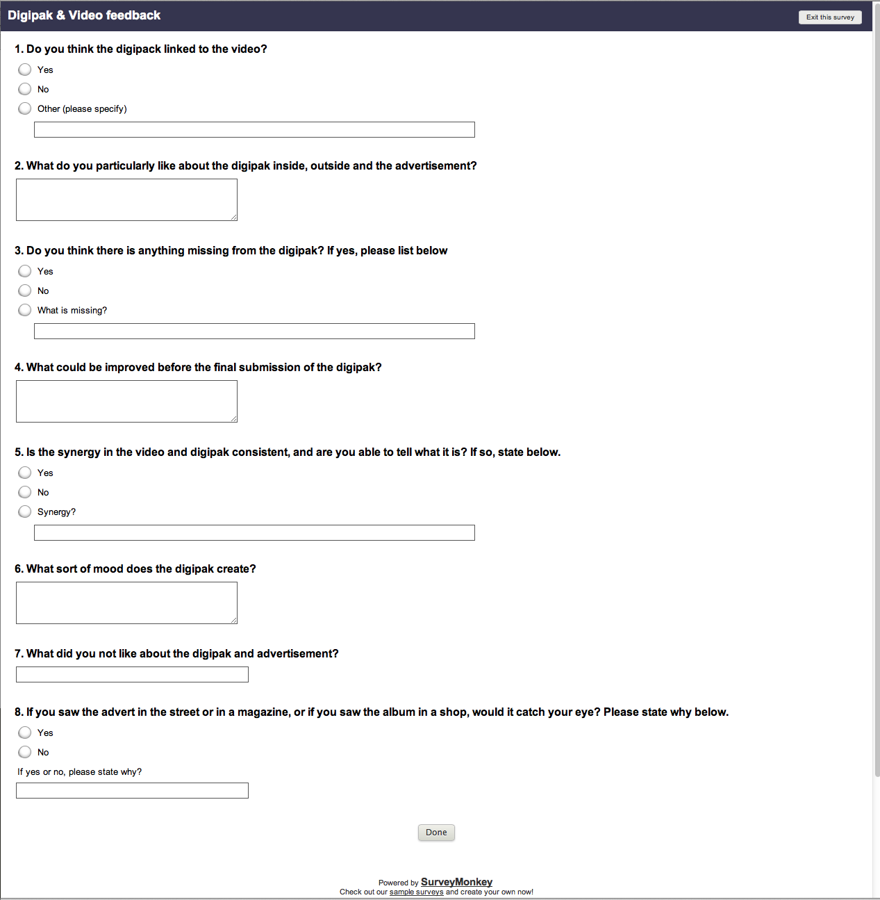
Along with this, i created a survey on survey monkey to collect feedback from my target audience. This is a good way of collecting data because it is anonymous so it allows them to be honest about what they thought about it.
Overall, my target audience have said that it all works well together, all the elements look good. They liked the colour schemes within the digipak, and they also said that there was a clear link to the video and the digipak. Also, they mentioned that if they saw it they would buy it because it was eye catching, and suitable to the genre.
Also, i received feedback from my teacher, she said this:
This feedback from my teacher allowed me to improve my digipak and make it look better. It also allowed me to see things that i didn't necessarily notice before, and probably wouldn't have noticed had it not have been stated. After receiving this feedback, i adjusted the digipak and advert to make it more appealing to my target audience and make it look better overall.
Click here to take survey
Evaluation: 1- In what ways does your media products use, develop or challenge forms and conventions of real media products?
Carol Vernallis studied editing and camerwork closely in music videos. She observed that edits in music videos come much more frequently than in a film that may stand out as disjuncture and that the editing seems to have a rhythmic basis closely connected to the song.
- Camera moves in time with the music
- Use of repetition for certain shots
- Lots of close ups
- Other frames more important than others02
- 1.Shot for base track is frequently used

Close ups were used in my music video which follows Vernallis's Theory

Goodwin Theory:
Andrew Goodwin feels that traditional narrative doesn't really apply to pop videos. He said that pop videos approach narratives from a different angle to novels and films. Andrew Goodwin said there are reasons for the different narrative structure.
Disjuncture is where the lyrics have little or no connection to the video, or they could possibly contradict the video.
Evaluation: Question 4 Plan
Feedback From peers about music video- What could have been improved and what they liked
Needed more change of costume
But good shots of artist and good locations
Needed more change of costume
But good shots of artist and good locations
Evaluation: Question 3 Plan
Blogger- To show work and planning and research
Instagram- To show previews of locations and footage
Twitter- To talk and keep people updated about our video journey
Slide share- To show pics of our journey of filming
Final cut pro- To edit
Instagram- To show previews of locations and footage
Twitter- To talk and keep people updated about our video journey
Slide share- To show pics of our journey of filming
Final cut pro- To edit
Evaluation: Question 1 Plan
Carol Vernallis Theroy:
Camera moves with the beat and rhythm of the music video
- Constant use of base tracks to give structure and form to the video
- Jump cuts to change the pace of the video to the song to keep the audience engaged and excited
- Edits such as transitions and wipes to draw the audiences' attention
Andrew Goodwin Theory:
Disjuncture, where the lyrics have little or no connection to the video, or they could possibly contradict the video.Evaluation: 2- How effective is the combination of your main product and ancillary texts?
Synergy
We decided as a group to use my braids as our synergy for the music video. We throught that braids would be a unique and interesting was as this look was consistant throughout the music video and also in digipack.
Here is a pic of brandy from her music video- Put it down- ft Chris Brown. She was consistand and was able to keep this synergy of braids throughout her music video. As you can see she is tounching her hair as she is showing if off in from of the camera.
Orininnaly we planned to have white air max nike trainers as the synergy as I would have to wear them throughout out the video but as part of costume change and being versatile we decided to get rid of that synergy and use the braids as they are very long, destinctive and unique.

Synergy with Digi Pack/Advertisement
We made show that not only did synergy occur throughout the music video but also on the digi pack and advertisement.
Overall I have a great and better understanding of synergy and how to use it and how to keep it consistand throughout.
Q.4
What have you learned from your audience feedback?
I received feedback from my music video and ancillary work (digipak and ad). Feedback is very important as you're able to make any changes before you release the final product.
Rough cut feedback
We received wonderful feedback for our rough cut. Members of our class said we had lovely locations, good shots, the graffiti was eye catching, there was good framing and everybody liked the use of pans and tilts in our music video. We were advised to not have our artist standing in front of a building as it looked like the buildings were coming out of the artists head. We took action and made sure we did not make buildings look as if they were coming out of Jaleesa's head when we next filmed. Click this link to watch our rough cut feedback #1 Click this link to watch our rough cut feedback #2
After the screening at the cinema feedback
The overall feedback was that we needed more outfit changes and more close ups. Other than that the editing and camera work was really good.
Click this link to view our feedback from our completed music video
Click this link to view our feedback from our completed music video
After our screening of our music video at the cinema I decided to ask for feedback from two girls and 1 boy, so that I can hear a range of opinons from both genders.
Ancillary Feedback
 |
| Feedback from my teacher of my ancillary work |
I pitched my ideas of my digipack
and advertisement to my teacher and requested feedback from her. I
received very good feedback and my teacher liked the reason of my font
styles and my colour scheme. The feedback I got was to change the name
of the album. My album name is called "Jaleesa" and my teacher thought
it would be better to call it "Jaleesa the album". This is because an
artist would name their album their name if they already have previous
albums.
Thursday, 23 January 2014
Evaluation: Question 3 plan
Question: How did you use media technologies in the construction and research, planning and evaluation stages?

This is a gif of all the technologies that i've used throughout the making of the ancillary and the music video.
Within this question, I will outline how and why I used all of these media technologies:
• Cameras & memory cards - to film and save work
• Blogger - to research, plan and evaluate
• Apps and websites - displaying work
• Twitter & Instagram - Keep teachers updated with filming progress
• Final cut pro - Editing adding effects etc
• Photoshop & Quark express - construction of my ancillary products
• Internet - for research purposes
In this evaluation question I will also use screenshots to portray how I did what I did during the making of my digipak and advertisement. Also, I intend on using time toast to create a timeline of the journey while creating my ancillary products and to help me account for all the developments and the production stages.
Evaluation: Question 4 plan
Question: What have you learned from your audience feedback?
In this question I will speak about the importance of audience feedback and how it allows me to better my product and make it more appealing. Although I don't have any audience reactions from the screening of the music video, I will talk about I felt that it went. However I will embed some videos of audience reactions to my digipak and advertisement.
Also, I will create a small documentary possibly on slideshare, of my trip to the cinema. This will contain how I feel things went during the screening of the music video and my thoughts an feelings towards the whole expirience as a whole.
Wednesday, 22 January 2014
Question 1: In what ways does your media products use, develop or challenge forms and conventions of real media products?
Before we started to make our music videos, we were taught that there were different types of conventions of a music video. The first one that I learnt was Laura Mulvery's theory which was that women in music videos are turned into sex objects for the pleasure of a man. We did not follow this theory because the person who was going to perform (Jaleesa) was not comfortable with this and it wouldn't match the music. Then theres Carol Vernallis theory which we used and she found that edits are used a lot more frequently in music video compared to films and that they stand out as disjuncture and that the editing seems to have a rhythmic basis closely connected to the song. The main points of Carol's observation are:
- Edits may be very obvious to draw attention to themselves such as special effects
- The rule of continuity editing are broken in order to bring attention to what is on the screen
- Jump cuts are often used
- The camera may move in time with the music.
We used this quite a bit because this made our music video more interesting and enjoyable to watch. The last one that we learnt about was from Andrew Goodwin. Andrew Goodwin feels that traditional narrative doesn't really apply to pop videos. He said that pop videos approach narratives from a different angle to novels and films. He said that are three different relationships between the music and the music video. There was 1. illustration 2. amplification and 3. disjuncture and that is the one we used.This is where there is a little connection between the lyric and video or where the video contradicts the lyric. In "Candy Rain" video by Soul For Real, it sings about how it feel to be in love and the video is 4 boys dancing and singing.
What inspired my ideas to put forward for our music video was a video called "Trust And Believe" by Keyshia Cole.What inspired me from Keyshia Cole's music video is the story line in the video and the shots that were used to show Keyshia facial expressions while singing and how she felt about her boyfriend cheating on her. The story line in the video will be slightly similar to our music video because both of the videos is about the main girl/artist who has a boyfriend and the boyfriend cheats on her. The shots that I really like were the close ups and the extreme close ups of Keyshia's face.
Monday, 20 January 2014
Q.2
| This is a gif from Brandy ft Chris Brown- Put it down music video. The artist has braids and is showing it off by touching it and flicking it. |
Evaluation question 1: In what ways does your media products use, develop or challenge forms and conventions of real media products? FINAL
In what ways does your media products use, develop or challenge forms and conventions of real media products?
Within our music video the main conventions that we followed are the conventions mentioned by Carol Vernallis. She stated that within music videos the:
Obvious edits & transitions:
The video that inspired me:

This gif comes from the music video called Latch by Disclosure. This video inspired me to create a similar effect at the beginning of the music video by doing fast paced shots of popular London locations. Although the shots within this actual clip are of people and ours is of locations, and the clip is more slow paced than seen in the video that we created. I feel that the rapid change of person/scenery keeps the audience's attention, and that was the effect we were going for.
However, in my digipak i haven taken inspiration from Eliza Doolittle's digipack to incorporate colour into Jaleesa's outfit. But i decided to take the simplicity of other artists' albums such as Swedish house mafia and Katy B. The reason why I decided to add elements of different artist's album to my own is because I liked the effect that it creates and i think it is appropriate for a new upcoming artist. I think the concept of having a close up of the artist's face on the front cover similar to the Swedish house mafia album was a good idea especially since it was a new artist and it is a good way of getting her face more known.

Within our music video the main conventions that we followed are the conventions mentioned by Carol Vernallis. She stated that within music videos the:
- Camera moves with the beat and rhythm of the music video
- Obvious edits such as transitions and wipes to draw the audiences' attention
- Constant use of base tracks to give structure and form to the video
- Jump cuts are common to change the pace of the video to the song to keep the audience engaged
We also followed one of the the conventions stated by Andrew Goodwin:
- Disjuncture, where the lyrics have little or no connection to the video, or they could possibly contradict the video.
Obvious edits & transitions:
We didn't follow any of Laura Mulvey's theory because it wasn't appropriate and it didn't attract the target audience that we intended on attracting. The reason why we followed Carol Vernallis' conventions is because they were all about keeping the audience interested and to catch their attention frequently throughout the video with fast paced edits to the beat of the song and effects and transitions.
The video that inspired me:
This gif comes from the music video called Latch by Disclosure. This video inspired me to create a similar effect at the beginning of the music video by doing fast paced shots of popular London locations. Although the shots within this actual clip are of people and ours is of locations, and the clip is more slow paced than seen in the video that we created. I feel that the rapid change of person/scenery keeps the audience's attention, and that was the effect we were going for.
However, in my digipak i haven taken inspiration from Eliza Doolittle's digipack to incorporate colour into Jaleesa's outfit. But i decided to take the simplicity of other artists' albums such as Swedish house mafia and Katy B. The reason why I decided to add elements of different artist's album to my own is because I liked the effect that it creates and i think it is appropriate for a new upcoming artist. I think the concept of having a close up of the artist's face on the front cover similar to the Swedish house mafia album was a good idea especially since it was a new artist and it is a good way of getting her face more known.
Evaluation: Question 1 plan
Question: In what ways does your media products use, develop or challenge forms and conventions of real media products?
In addition to this I will use a program such as Viola or IshowU to map out our video with others that have inspired me and it will allow me to compare and contrast the similarities between our music video and others. The way that these websites work are in a similar way to camtasia, it allows you to put a video in and add annotations of speech over it and to compare your video to another which will me a good way in helping me to answer this question.
Saturday, 18 January 2014
Q.1
| Jump cuts are used to contradict the pace of the song. |
| Transitions used in our music video |
Overall, I think my group stuck to the genre which is 'house' when creating our media products as people who are interested in house music like to listen to the beat of the song rather than the lyrics. So having a disjuncture music video makes it even more interesting for the audience. I was influenced by Eliza Doolittle who is also an artist of 'house' genre and I noticed that her album cover looked fun, bright and different. I also made my digipack in this way and I feel that I have stuck with the genre and I'm sure that the audience will be able to tell that the album is of the genre of house from just looking at it.
We used a range of camera shot types to identify and rebrand the artist.
| Extreme close up shot of Jaleesa's Lips |
| Mid shot |
Thursday, 16 January 2014
Question 2: Plan
Synergy
I will talk about the synergy that is shared between the digipak and advert.
I will talk about the colours that are used on both the digipak and the advert and I will also talk about her braids being the synergy throughout the whole making of the music video and the making of the digipak and advert.
Evaluation Q.2 Plan:
How effective is the combination of your main product (video) and ancillary texts (digipak and advertisement)?
Synergy used in music video, digipack and advertisement:
Artists hair style (braids) shown in music video, digipack and advertisement
Clouds shown in music video, digipack and advertisement
In the gifs you can see that clouds were shown in our music video and so were braids.
- I have also used synergy on the advertisement and the front cover where I have used the same image.
- Used the same text and font throughout the digipak and advertisement.
- Same clothes worn on digipack and ad.
- Same colour font
- Same background
Subscribe to:
Comments (Atom)


